01 · Logo
The saltline.
Lowercase wordmark in Bricolage Grotesque ExtraBold, tracked tight. The descriptor is always set in caps, wide tracking, never larger than a third of the wordmark's x-height.
The mark is a Gulf sunset cut by a clean line. The sun is the house, the horizontal cut is the line where grime ends and clean begins, the two waves are the rinse — and the bay we work around. Minimum size 20px. Keep one sun-width of clear space on every side.
02 · Color
Sun-bleached, not neon.
Limestone carries most of every layout. Gulf is for type and weight. Citrus is for one thing per screen: the action.
03 · Type
Sturdy, with a wink.
One confident grotesque, one italic serif used for the turn of phrase, one quiet sans for everything you read.
04 · Voice
Talk like the neighbor who knows.
Plain, specific and a little dry. We explain the why, give the price up front and never sound like a sales call.
We are
- Specific: PSI, months, dollars
- Direct: price before the pitch
- Local: street names, not "your area"
- Dry-funny, once per page
We aren't
- Hype: "#1", "best in Florida"
- Vague: "top-quality solutions"
- Pushy: countdowns, fake urgency
- Technical for its own sake
"Those black streaks are algae. We kill it at the root, so it takes years to come back."
"We provide premium, eco-friendly exterior cleaning solutions for discerning homeowners."
05 · Photography
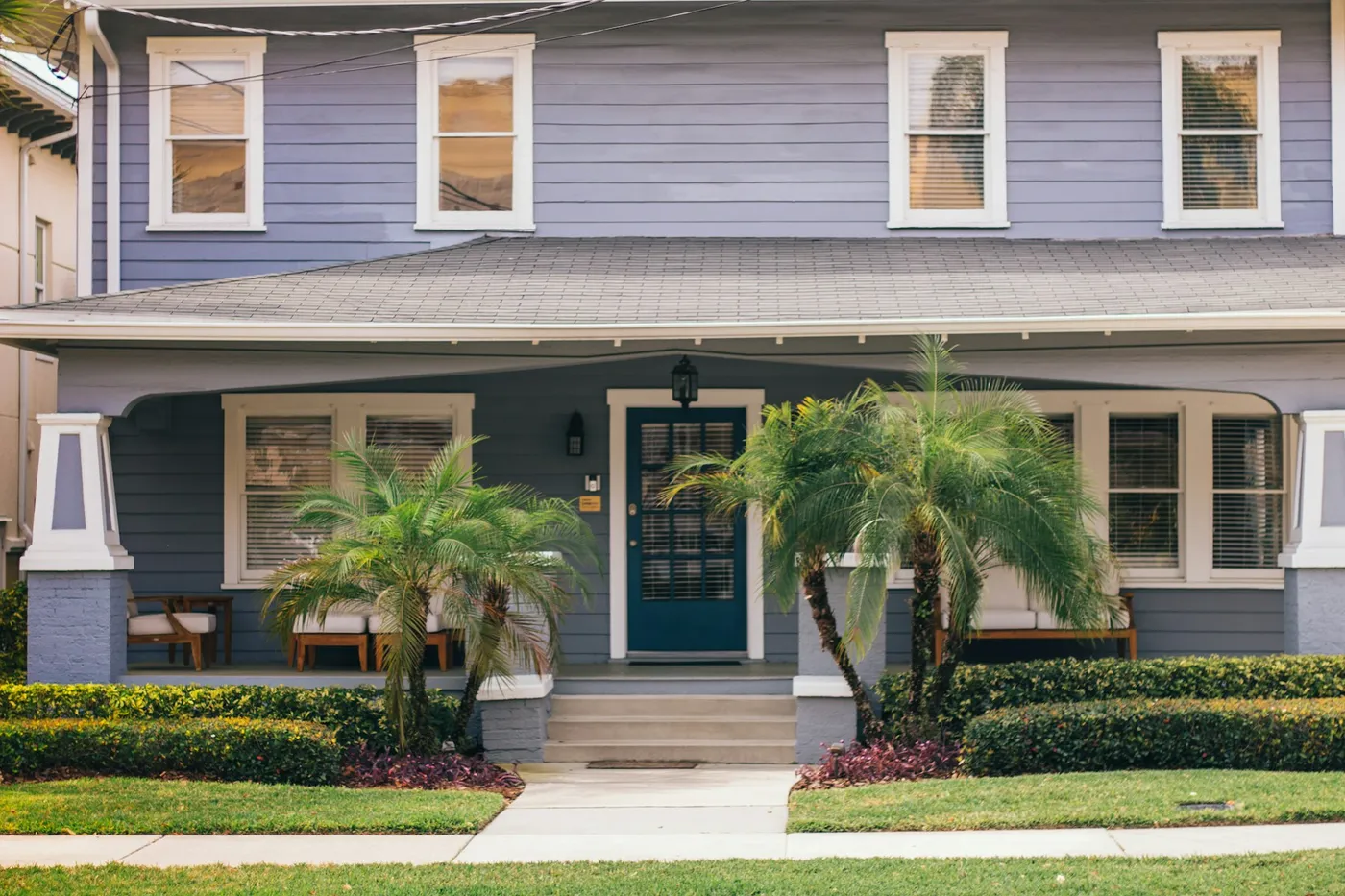
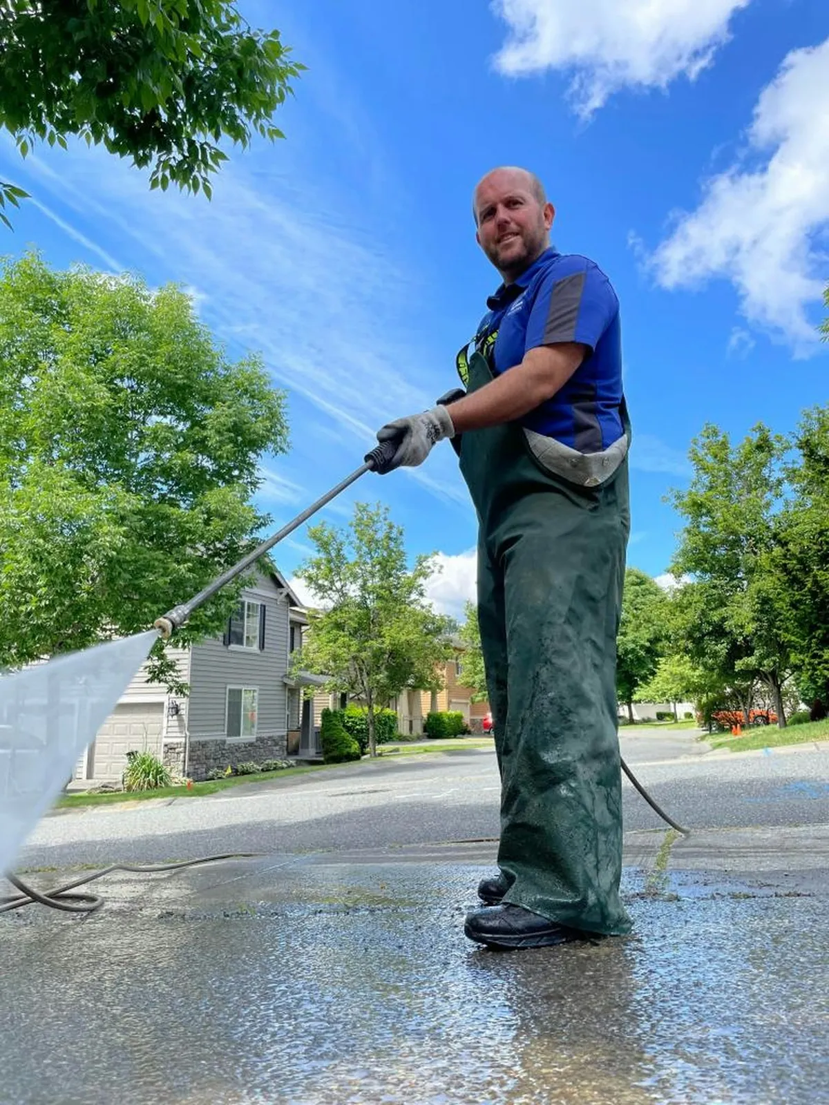
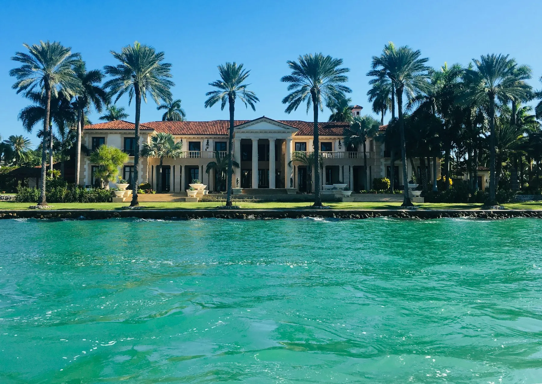
Real houses, high noon.
Bright daylight, blue sky, palms in frame. Show the finished house more than the equipment. People at work, never posed to camera.
06 · In the wild
Trucks, cards & doors.
A white truck with one citrus band is the most-seen ad we own. The door hanger always shows a price and a QR, never a stock family.
Price it in 60 seconds.
saltlineexterior.com · (727) 555-0148
We just washed your neighbor's house. Yours is next?
Neighbor price this week: 10% off any house wash on this street.
Scan to price your home, or text (727) 555-0148.